Brand Guidelines
CuraSky Brand Kit
Guidelines for correct and consistent use of CuraSky branding.
Our logo
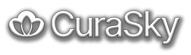
The CuraSky logo features a simple cloud shape with a lotus flower at its centre.
The cloud symbolises our technology-enabled approach and seamless connectivity, while the lotus represents our India-based team and the wellness we restore to NHS practices.
In body copy, the word CuraSky is always written with a capital C and a capital S.
Logo usage
The logo should always appear in either CuraSky blue or white.
Contrast is important. Use the CuraSky blue logo on a white background and the white logo on photographic or dark backgrounds.
Leave space around the logo that's half as tall as the logo itself. Use this same amount of space on all sides.
Backgrounds
Minimum clearing space
Guidance
Don't stretch, rotate or distort the logo proportions.
Don't modify the logo in any way, such as adding effects.
Don't outline the logo.

Don't place the logo on busy or low-contrast backgrounds.
Don't change the logo colors to anything other than blue or white.
Don't place the logo too close to other elements.
Brand colours
Our primary blue conveys trust and professionalism, reflecting the reliability NHS practices need.
Sky blue accents echo our brand name while maintaining a welcoming tone, with complementary orange applied sparingly for emphasis and warmth.
Typography
CuraSky uses Inter for all its typography, an open-source neo-grotesque sans-serif typeface carefully crafted for both screen and print.
Download Inter